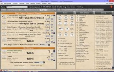
First off, I like the new look of the panels. Even the white boxes (actually love em), so much easier finding what I need. In fact, I'd like the same for Initiative and Speed if possible.
One nit pick, it would be nice if it handled long text better. Long weapon text or when you get 3-4 attacks, the text can be too long and chop off. It can also loose spacing between the to hit numbers and damage dice (ie +11/+61d8+6). Even if I only show 3 panels, it's not enough room for weapon display.
On the weapons tab, It looks like it does a much better job wrapping long text but the "container button" can get pushed in the critical numbers area.
One request, it would be nice to show active "conditions" in a panel (at the bottom, maybe before feats or something). Sometimes you check that "Fatigue" or "sickened" box and forget about it...
Second request would be that HL still doesn't recognize input boxes for soft (or virtual) keyboards in windows 8.1. eg to enter HP damage, I have to click in the box, then click the keyboard button on the task bar, enter damage, close keyboard. It would be nice if it auto popped the soft keyboard straight to number pad and closed if you touch/clicked outside the input box.
Here are some screenshots from my Surface Pro 3. Note, I have modest screen scaling turned on at 150% (vs 200%) as it's a HDPI screen. I supplied another shot without scaling turn on (which causes HL to be way to small to be usable and a lot of wasted space).

")
